Here you’ll find definitions of common technical terms used in graphic design, printing, press advertising and publishing. Most will be in current use, but some will have been rendered redundant by advances in technology. Tap on any term in the list below to find its definition. Hope it helps you in your quest for knowledge, but if you don’t find the definition you want, please feel free to get in touch for help.

A
B
C
D
E
F
G
H
I
J
K
L
M
N
O
P
Q
R
S
T
U
V
W
X
Y
See ISO Paper Sizes.
The vertical arrangement of lines of text. This can be left aligned (also known as ranged left or left justified), right aligned (also known as ranged right or right justified), centred, or justified (also known as fully justified) where the text is aligned both left and right. The opposite of justified is ragged, so text that is ‘left justified’, or ‘ranged left’, is also ‘ragged right’.

Text alignment
Justified text in a narrow column width can lead to unsightly rivers opening up in the text.
A standard US document size, also known as Letter, which measures 11 x 8.5 inches (279 x 216 mm). See also Quarto.
An element in the HTML code of an electronic document (denoted by the <a> tag), that enables a piece of text, or area of an image, to be made live for redirecting the reader to another page, or another place in the document. See also Hyperlink.
Jagged or smudgy areas in a digital image, caused by file compression. The higher the level of compression, and the more times the file is saved with compression applied, the more prominent the effect.
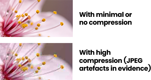
JPEG artefacts
See also Lossy.
See Coated.
See Finished Artwork.
The part of a lowercase letter that extends above the x-height.
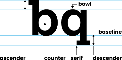
Letterform features
See also Descender.
A photograph, graphic, or font, available for use in a document. Ideally, the creator of a document should own the rights to the assets they use in it, so copyright is not infringed.
See ISO Paper Sizes.
A striped graphic that expresses an item’s unique catalogue number. In book publishing, the graphic is usually placed on a book’s back cover, and expresses the book’s ISBN. These codes are useful, mainly, for retailers that use EPOS (Electronic Point-of-Sale) systems.

ISBN barcode
The imaginary line on which a typographical character sits.
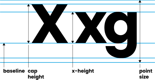
Typesetting features
A line or path in a vector graphic.
See Raster.
One of the four process colours used in full colour litho, digital and screen printing. There are any number of reasons why K is used to represent black. B would be confused with Blue in the RGB colour model. K could stand for key colour, kohl (a black substance) or simply be used as it’s the last letter of ‘black’! See also CMYK.
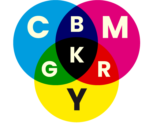
CMYK colour model
Also known as Gothic Script or Old English, this is a design of letterform that originates from written scripts of the Middle Ages.
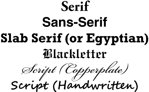
Type styles
The extension of print beyond the intended finished page size, prior to trimming, so as to allow print to extend to the very edge of the page in the finished document.
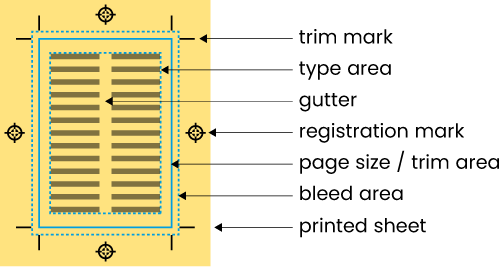
Page artwork features
Pure embossing, not combined with any other process such as printing.
Heavier weights of paper, characterised by thickness and stiffness—as a rule-of-thumb, anything over 220 gsm in weight. Also known as card.
The main text, or style of the bulk of text, in a document. See also Paragraph Style.
In typography, the curved part of a letterform, which creates, and encloses, the counter.

Letterform features
See ISO Paper Sizes.
Abbreviation of capital height. The height of the uppercase (or capital) X of a font.

Typesetting features
Text positioned on, or adjacent to, an illustration or photograph, to describe it or comment on it.
A high-quality paper used for drawing and stationery.
A typographical letter, symbol or punctuation mark.
A named text style, specified within a software application by the user (or already existing within the application) to be applied to individual characters, words and phrases. Parameters within the style will include things like font, font size, font weight, and character spacing. These styles can help the user achieve consistency of presentation throughout their document. In an electronic document, such as an e-book, the equivalent of the character style is the ‘span class’. See also Paragraph Style and Style Sheet.
The colour model most commonly used to replicate full colour in print, especially in litho, digital and screen printing. Uses four colours of ink, overlaid in varying tints; the colours are Cyan (C), Magenta (M), Yellow (Y) and Black (K). Also known as full colour, process colour, and full colour process. See also RGB, Spot Colour.

CMYK colour model
A paper or board, also known as art, which is coated with a compound, to give smoothness of texture, and uniformity of thickness. Common variants are gloss, matt and silk. See also Uncoated.
Reduction in the amount of data used to describe a bitmap (raster) image, resulting in a lower file size, but also in a reduction in image quality. The most commonly-used image file format allowing compression is JPEG. See also Artefacts, Lossy.

JPEG artefacts
A zigzag-type fold giving a pleated effect. See also Roll Fold.
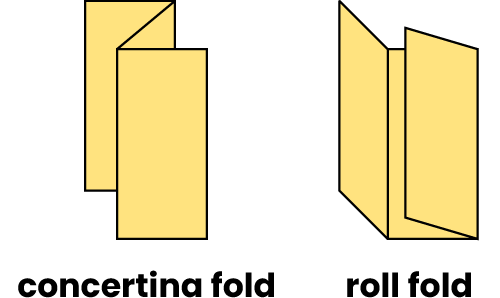
Fold types
The text content of a document, advertisement or web site. See also Copywriting.
Abbreviated to ©, this is the automatic establishment of the intellectual property rights of the author, or creator, of a piece of work. This bars any use of the work in whole, or part, by unauthorised individuals or organisations, for a period of time.
The writing of text for a promotional or informative document, advertisement, or web site. See also Copy.
In typography, the closed space within the bowl of a letterform.

Letterform features
The indentation of a material (e.g. paper or board) to enable clean folding and to minimise cracking.
See Trim Marks.
Cascading Style Sheet. See Style Sheet.
Computer to Plate; a technology that allows litho printing plates to be made directly from computer files, without the need for an intermediate film stage.
An image of irregular shape, isolated on a transparent background. See also Squared-Up Image.
Artwork indicating the shape, and configuration, of a cutter or forme. See also Die Cutting.
One of the four process colours used in full colour litho, digital and screen printing. See also CMYK.

CMYK colour model
The reverse of an embossed surface.
In publishing, a tribute to an individual, a group of people, or an organisation, given by an author. This is usually placed on its own dedication page near the start of the book, just after the Title Page and Verso.
The part of a lowercase letter that extends below the baseline. See also Ascender.

Letterform features
The original term for page layout, and graphics creation, using computer applications.
The process of cutting a special shape out of a material, such as paper or board, using a cutter or forme. See also Cutter Guide.
A printing method that uses either inkjets to apply coloured inks to a substrate, or laser heat to adhere coloured toners to one. Suitable for printing full colour in small to medium quantities.
The increase in dot size in a printed halftone image due to ink absorption.
The original mechanical method for creating a halftone of an image or a tint of a colour.
A shadow placed ‘under’ a graphic object, to give the appearance of it being raised over what’s behind it.
See Desktop Publishing.
An image using two base colours to create its range of tones.
An additional protective outer cover, wrapped around the fixed cover of a hardback book. Often printed with graphics akin to those on a paperback book cover.
The placing of an image or type asset, such as a photograph, graphic, or font, within a document, so that all the information needed to render it is contained within the document itself, as opposed to linking the asset.
Raising the surface of a material (e.g. paper) by use of a punch or die. See also Blind Embossing.
Sandwiching a material between two clear plastic layers. See also Lamination.
Encapsulated Post Script; a digital image file format that can include vector and/or raster components, and supports spot colour. If purely vector, it will reproduce cleanly and sharply at any magnification. It is the ideal base file format for line art.
The final layout of text and images, ready for press and/or publication.
See Thermography.
One variant of a typeface, e.g. Helvetica Bold Oblique.
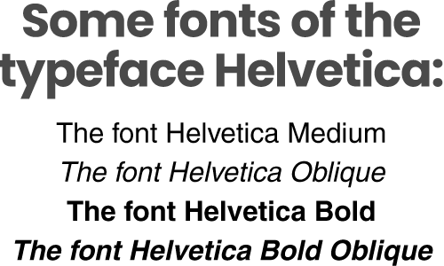
Font or typeface?
Configuration of metal blades, used to cut a special shape out of paper or board, and/or to place creases. See also Die Cutting.
See CMYK.

CMYK colour model
The range of possible colours within a given colour model.
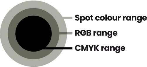
Colour ranges/gamuts
Graphics Interchange Format; graphics format which allows a range of 256 colours and supports transparency. Good for simple web graphics.
A coated paper or board with a gloss finish.
See Graduation.
Also known as a gradient; an area of colour tint that blends smoothly from one colour to another, or through multiple colours.
The direction of the fibres within a paper or board. Folding a sheet along the grain rather than across it can limit cracking. A sheet of board trimmed long-grain (with the grain running parallel to the long edge) will have a greater stiffness than one trimmed short-grain (grain running parallel to the short edge).
An intaglio printing process whereby recesses etched into the printing plate hold the ink to be printed. Used widely in colour magazine printing.
A continuous-tone image that uses tints of black only, to give a range of greys.
An aid to page layout, which can indicate margins, columns, and line spacing, as necessary.
(1) The space between columns on a page. (2) The space between trim marks on an imposition. (3) The space between the text area and the binding, also known as the inner margin.

Page features
An array of dots (round, elliptical or square) of varying sizes allowing the illusion of a continuous-tone (or photographic) image to be created in commercial print processes such as litho and silk screen.
A book with a stiff board cover, usually covered with a textured paper, cloth, plastic or leather. The cover has a well-defined spine, with creased folds which allow the book to lie more flat when open. Sometimes wrapped with a dust jacket. See also Paperback.
A printing process that uses six colours, to achieve a more vivid result than can be achieved with CMYK alone.
See Thermography.
A letterpress method of printing, using metal type.
Hypertext Markup Language. The standard language for the coding of web pages and e-books. See also Style Sheet.
In electronic publications, and on the Web, a way to redirect the reader to another page, or another place in the document, when they press a specific portion of text or image. The text or image the reader presses is called an anchor. In an e-book, for example, hyperlinks are used for the entries in the Table of Contents, to allow the reader to go directly to the content they want. See also Link (image).
(1) A visual reproduction, such as a photograph. (2) The impression given of an individual, an organisation, or a product.
The positioning of multiple pages on sheets, so that when printed, collated, folded, bound and trimmed, the pages appear in the correct order. See also Printer’s Pairs.
In publishing, a name that a publisher publishes under.
An extra margin of space added to the left and/or right of a line, or paragraph, of text in a document, to distiguish it from the main body of text.
In a publication, a list of topics and other references with the page numbers on which they are found. In reflowable e-books, page numbers are irrelevant, so an alternative convention is needed for an index, suited to the content and structure of the book. Indexes are usually located at the end of the publication. See also Table of Contents.
A printing process whereby recesses in the printing plate, or block, hold the ink to be applied. Gravure is an intaglio process.
International Standard Book Number; a unique book identifier in numerical form, obtained through an affiliate of the International ISBN Agency. This number is often also expressed as a barcode, usually located on the cover of the book.

ISBN barcode
ISO is the International Organization for Standardization, responsible for the creation of the ‘A’ and ‘B’ standard paper sizes and the ‘C’ standard envelope sizes. ‘A’ sizes fit unfolded within the corresponding ‘C’ size envelopes (with one fold allowing them to fit into the next ‘C’ size down and a DL envelope fitting an A4 sheet folded twice, widthways, into a third of its length). ‘B’ sizes are used mainly on printing presses to enable trimming to suitable ‘A’ sizes—the ‘RA’ and ‘SRA’ series of sizes are also used for this purpose.
4A0 1682 x 2378
2A0 1189 x 1682
A0 841 x 1189
A1 594 x 841
A2 420 x 594
A3 297 x 420
A4 210 x 297
A5 148 x 210
A6 105 x 148
A7 74 x 105
A8 52 x 74
A9 37 x 52
A10 26 x 37
B0 1000 x 1414
B1 707 x 1000
B2 500 x 707
B3 353 x 500
B4 250 x 353
B5 176 x 250
B6 125 x 176
B7 88 x 125
B8 62 x 88
B9 44 x 62
B10 31 x 44
C0 917 x 1297
C1 648 x 917
C2 458 x 648
C3 324 x 458
C4 229 x 324
C5 162 x 229
C6 114 x 162
C7 81 x 114
C8 57 x 81
C9 40 x 57
C10 28 x 40
DL 110 x 220
RA0 860 x 1220
RA1 610 x 860
RA2 430 x 610
RA3 305 x 430
RA4 215 x 305
SRA0 900 x 1280
SRA1 640 x 900
SRA2 450 x 640
SRA3 320 x 450
SRA4 225 x 320
Joint Photographic Experts Group; an image file format that allows compression of the data. This balances file size against quality—the more compression is applied, the smaller the file will be, and the lower the quality of the image.
See Alignment.
See Black.
The spacing of two type characters adjacent to each other, often adjusted to make the characters fit better together visually.
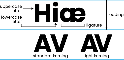
Type features
Paper or board with a lined texture created during manufacture.
A clear plastic covering applied to a material (e.g. paper or board), which can have a gloss, matt, or satin finish. See also Encapsulation.
In typography, the distance from one baseline to the next; commonly expressed in points, millimetres, or as a percentage of the point size of the type.

Type features
A standard US paper size, measuring 14 x 8.5 inches (356 x 216 mm).
A relief printing method whereby ink is transferred onto the paper by raised areas composed of type, complete blocks and/or other elements. See also Rubber Stereo.
The joining of two type characters whose shapes and/or sounds overlap, to make a single character, such as fi into fi and ae into æ (as featured throughout the book Away with the Færies, by Madeleine Cook). There are archaic names for some of these, such as ash for Æ/æ and ethel for Œ/œ.

Type features
Artwork made up of solid areas only. Also known as vector artwork.
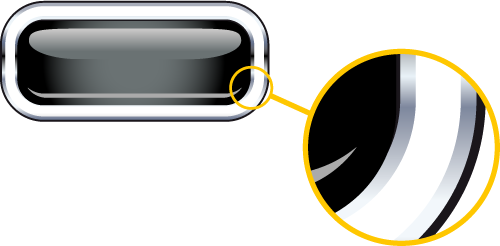
Vector image
A placeholder for a photograph or graphic, where the source image remains in its original location, i.e. it is not embedded in the document. Also refers to the image that is being employed in this way. The technique is used mainly in page layout applications, such as Adobe InDesign. See also Hyperlink.
The basis for most commercial print work, this is a printing process which uses the repulsion of water, by oil, on a single flat surface, or plate (commonly metal, but can be paper). Water-based ink remains on the areas of the plate where there is no oil-based substance, and is then transferred to the paper or board. This transfer often happens via an intermediate surface, a process known as offset lithography.
A descriptive term for a digital image format that loses data through compression, affecting file size and image quality. JPEG is a lossy format.
The ‘small’, as opposed to capital, letters. The name comes from the days of letterpress printing, when this set of letters was kept in a compartment, or case, beneath the capital (or uppercase) letters.

Type features
A varnish applied to a print job on the press. See also Spot Varnish, UV Varnish.
One of the four process colours used in full colour litho, digital and screen printing. See also CMYK.

CMYK colour model
The preparatory work before the start of a print run.
A coated paper or board with a matt finish.
See Finished Artwork.
An image produced using only one base colour.
The default file format of a software application. E.g. PSD is the native format of Photoshop®, AI is the native format of Illustrator®, INDD is the native format of InDesign®.
In typography, another word for an italic version of a typeface.

Font or typeface?
A paper size derived from a sheet being folded three times, to make eight leaves (sixteen pages). In modern use, this refers to a book of around 200-250 mm in height.
In typography, a word, or group of words, on its own at the bottom of a column of text, separated from the rest of its paragraph, which is in another column. See also Widow.

Widows and orphans
The overlay of one ink colour on another during the printing process, using translucency and combinations of dot tints to create further colours.
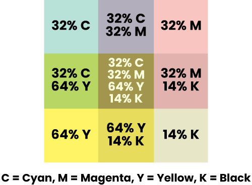
Overprint
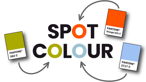
A widely-used ink colour formulation system in the printing industry. Each colour is made with proscribed constituents in specified proportions, and is given a reference number, or name, like Pantone® (or PMS) 286 C, or Pantone® Warm Red U. ‘C’ and ‘U’ denote reproduction of the colour on coated or uncoated stock. Includes special colours like metallic inks and fluorescent inks. See also Spot Colour.
Spot colour
A book with a cover that is made from a single piece of light, flexible board. The cover is usually glued into position, and is often printed with a promotional or decorative design on its outside, and occasionally on its inside as well. See also Hardback.
See ISO Paper Sizes.
A named text style, specified within a software application by the user (or already existing within the application) to be applied to whole paragraphs. Parameters within the style will include things like font, font size, character and line spacing, text alignment, indents, and spacing above and below the paragraph. These styles can help the user achieve consistency of presentation throughout their document. In an electronic document, such as an e-book, the equivalent of the paragraph style is the ‘p class’. See also Character Style and Style Sheet.
Portable Document Format. Created by Adobe®, and revolving around its Acrobat® application, it is a widely-adopted format for the viewing and reproduction of documents outside their native applications. It has various levels of encoding, such as:
Standard, which is useful for general viewing and desktop printing purposes, where a low file size is preferable |
High Quality, which gives a better-quality result in desktop print, but has a larger file size |
Press Quality, which, depending on content, might have a much larger file size, but is of a sufficient quality to be used in commercial print. |
A document binding method that uses a spine of hot glue to secure the leaves, which are trimmed prior to binding. Many paperback books and large magazines are bound this way.
A measurement of type height no longer in common use, which is equal to 1/6th inch (4.23 mm) or 12 points. See also Point Size.
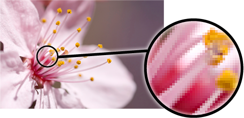
Picture cells; the square cells of colour that make up a digital image. See also Raster.
Raster image
Arranging several pieces of artwork together on a sheet, for printing. See also Imposition.
Portable Network Graphics; a digital image format with a wider colour range than GIF which is therefore better for photographic images. Like GIF, it also supports transparency (when in 24-bit). This format is widely supported on the Internet, and is useful there for cutout images, and in things like PowerPoint® presentations.
A measurement of type height, abbreviated as pt. There are 12 points to a pica (1/6th inch). The point size of a font includes the space above and below the letters, and gives it its standard line spacing or leading, a throwback to the days of metal type.

Typesetting features
The pairs of pages in an imposition for a printed document, arranged so that when the job is printed, collated, folded, trimmed and bound, the pages will appear in the correct order. These are not the same as spreads.
See CMYK.

CMYK colour model
A sample of a document for checking before the production run. Can be digital (on screen) or hard copy. See also Wet Proof.
An extract copied from a text, and featured separately in way that highlights it, and draws attention to it. A pull quote might be edited if its sense is lost when it’s read in isolation.
Where a sheet of paper is folded twice to produce a document of four leaves (eight pages) when trimmed. See also American Quarto.
A digital image made up of pixels, suitable for photographic reproduction. See also Vector.

Raster image
The right-hand page of a spread. See also Verso.
Abbreviated to ®, this is a trade mark which has been registered with the relevant authority, to assert the rights of the holder, and further guard against ‘passing off’.
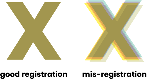
A printing term for the alignment of separate ink colours when inks are overlaid on each other. See also Registration Marks.
Registration
Marks placed on finished artwork to aid the correct registration (alignment) of separate ink colours.

Page artwork features
The number of pixels that make up a digital image, normally measured in pixels per centimetre or pixels per inch. In theory, the higher the resolution of an image, the higher the image quality is, and the greater the amount of detail the image can hold.
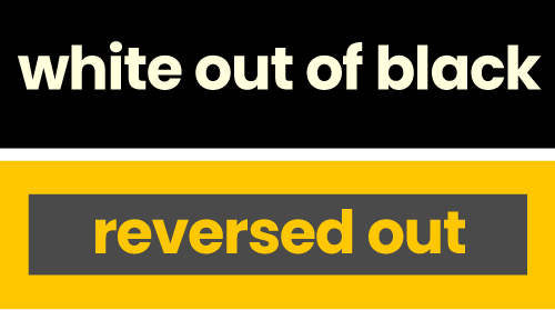
To make type or other elements lighter than the background they’re on. See also White Out.
White out and reversed out
A colour model with three constituent colours — Red (R), Green (G) and Blue (B). Used mainly for photographic, on-screen, and light-based applications. See also CMYK.
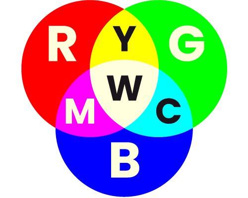
RGB colour model
A large, unsightly gap between words that runs through multiple lines in a block of text, often caused by justifying text in a narrow column. See also Alignment.
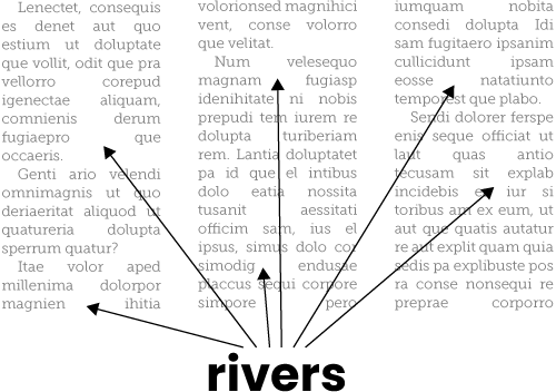
Rivers
Where a material is folded over and over on itself in the same direction. See also Concertina Fold.

Fold types
No, not a shockproof hi-fi, but a type of letterpress printing plate, produced in one piece, and used commonly in newspaper printing, where high volumes of print need to be produced quickly.
A binding process that uses metal staples.
A generic term for a typeface design that is of plain, undecorative appearance, with no serifs. Also known as grotesque, grotesk, grot and gothic. Arial and Helvetica are sans serif typefaces.

Type styles
A quick, rough visual of a design concept.
See Halftone.
A printing process which uses a fine mesh screen (often known as a silk screen). A relatively opaque and viscose ink is passed through untreated areas of the screen onto the substrate. Good for printing objects like corporate gifts and t-shirts.
The standard resolution of a graphic or image for use on a computer monitor or other screen. This is the standard for web-based imagery and is currently 72 ppi (pixels per inch).
A typeface style with a fluid or ‘handwritten’ design.

Type styles
(1) Details added to the ends of the strokes on letterforms.

Letterform features
(2) A generic term for a typeface design in which the characters feature serifs. Garamond and Times are serif typefaces. See also Slab Serif and Sans Serif.

Type styles
A sheet folded at least once to form part of a book, brochure, or other publication, when trimmed down.
A coated paper or board with a smooth matt finish.
See Screen Process.
(1) A type of serif that is square or block-like. (2) A generic term for a typeface style in which the characters feature slab serifs, also known as square serif or Egyptian. Rockwell and Stymie are slab serif typefaces.

Type styles
In publishing, the portion of a book’s cover between the front cover and back cover, which usually faces outwards when the book is on a shelf. If the spine is wide enough, it can contain information such as author name, book title, and publisher.
A printing term for a specified colour. Jobs printed in spot colour often use the Pantone Matching System® to specify the colour(s) to be printed.

Spot colour
A printing varnish applied to a specific area, or areas, of the printed sheet. See also Machine Varnish, UV Varnish.
A left-hand page (or verso), and right-hand page (or recto), side-by-side, as they would be appear in an open book. See also Printer’s Pairs.
An image of rectangular area. See also Cutout.
A printing term for paper and board.
A phrase attached to a name or logo, that attempts to sum up the organisation, or product, in a memorable way.
(1) Part of the shape of a letterform. (2) The thickness of a line, or path, in vector artwork, usually expressed in millimetres (mm) or points (pt).
Normally set out in the Cascading Style Sheets (CSS) language, a set of criteria for the styling of text within an electronic document, such as a web page or e-book. The standard style element for whole paragraphs is the ‘p class’, and that for individual characters, words and phrases is the ‘span class’—these are assigned to the text within the document’s HTML code by using tags. See also Character Style and Paragraph Style.
Small type that is placed just below the baseline, used in scientific and mathematical formulae. See also Superscript.
In printing, the material which is being printed on, e.g. paper or board.
Small type that is aligned to the top of the capital letters or numerals, used for reference and in mathematical expressions. See also Subscript.
Also known simply as the Contents, Contents Page, or TOC, it is a list of a publication’s chapter, section, or article titles, with their corresponding page numbers (if applicable). In reflowable e-books, page numbers are irrelevant, so each entry is instead a hyperlink that takes the reader to the correct place in the document. See also Index.
The notation within HTML code used to apply a particular style to a portion of text in an electronic document, such as a web page or e-book. Style tags are presented within brackets like <these>, and the associated styles are specified in a style sheet.
A process where a metallic foil is applied to a substrate, in a specific area, or areas.
Tagged Image File Format; a raster image file format, that supports CMYK, RGB and greyscale.
A percentage of a colour; if being used in a commercial print process, such as litho or silk screen, it will be rendered as a halftone. A 50% tint of black, for example, is a mid-grey, where ink coverage is 50%.
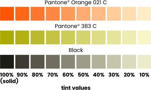
Colour tints
In a book, this is normally the first text page, containing the book title, author name, and any other relevant information such as publisher name and/or logo. See also Verso.
A small dot that forms a part of some type characters such as ‘i’, ‘j’, ‘!’ and ‘?’, which is generally circular or square, depending on the design of the typeface.
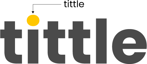
Tittle
Abbreviated to ™, this is commonly applied to business and product names and phrases, to establish the intellectual property rights of the owner, and guard against ‘passing off’ by others. See also Registered Trade Mark.
The overlapping of printing inks, to mitigate for, and avoid, gaps due to misregistration of ink colours during the print run. See also Registration.
Fine lines placed on finished artwork to indicate where the printed sheet should be trimmed.

Page features
A complete set of letterforms (characters) of a unified design; can refer to a font family, with each font in the family being a variant of the typeface style (e.g. regular, italic, bold).

Font or typeface?
A paper or board left with its natural finish. Cartridge and bond are uncoated papers. See also Coated.
The capital letters. The name comes from the days of letterpress printing, when this set of letters was kept in a compartment, or case, above the small (or lowercase) letters.

Type features
A printing varnish which is ‘cured’ using UV light and gives a bolder effect than a machine varnish. Available as a gloss or matt finish. See also Spot Varnish.
A digital graphic constructed with lines and fills. Vector graphics are totally scalable without loss of quality, and can be created in ‘drawing’ software applications like Adobe Illustrator and CorelDraw. See also EPS, Raster.

Vector image
In broad terms, the left-hand page of a spread. Specifically, in a book, the reverse of the Title Page, containing author and publishing information. See also Recto.
A graphic design mock-up. See also Scamp.
The overall thickness of a font. A typeface may come in a range of font thicknesses (or weights) like light, book, regular, bold, extra bold, and black.
The mass, or thickness, of a paper or board, usually measured in grams per square metre (abbreviated to gm-2, gram or gm). Heavier and/or thicker stocks, such as boards, tend to be measured in microns (thickness).
A printer’s proof, printed litho process on a dedicated proofing machine, so as to give the closest match to the final print job.
Type, or other elements, that are white on a darker background. ‘White out of black’, for example, describes elements that are white on a black background. Usually involves not printing the areas to remain white, if being printed on white paper. See also Reverse Out.

White out and reversed out
In typography, an isolated word, on a line on its own at the end of a paragraph. See also Orphan.

Widows and orphans
An uncoated paper with a flat, uniform texture.
In typography, the height of the lowercase x of a font, often considered in relation to the height of the capital letters (cap-height).

Typesetting features
One of the four process colours used in full colour litho, digital and screen printing. See also CMYK.

CMYK colour model