Here’s some useful information on text formatting, print methods, image formats, the use of colour and type, and other design hints & tips. If you don’t find the information you want, please feel free to get in touch for help.

With a design and print project it’s a good idea, as early as you can, to think about how you want to go about reproducing it in print. That will probably mean deciding how it’s going to be printed, so that can be taken into account during the design and artwork stage.
The printing method you’ll use will depend on factors such as how many copies of a given item you want to produce and how you envisage the final item being presented.
Below are brief descriptions of the three most-used print methods for this type of work, with some of their advantages and disadvantages.
Digital print comes in two main flavours—inkjet and laser. Commercial inkjet printing is generally reserved for fine art prints, and often goes by the name giclée (from the French verb gicler, meaning ‘to squirt’). As we’re not concerned with fine art printing here, we’ll concentrate on laser printing.
Laser printing uses laser heat to adhere coloured toners to the substrate. The quality of this print method has increased over the years and it’s now barely distinguishable from litho print. One quality of laser, as opposed to litho or indeed inkjet, is that the colour of the print is not affected by the substrate used because a significant proportion of the colour pigment lies on the surface rather than being absorbed by it.
One of the big advantages of digital print as a whole is that you can often produce a small quantity (even a single copy) of your item, in single-colour through to full-colour, more economically than through other processes like litho. That’s why it’s ideal for print-on-demand and low-volume production. With laser print, depending on the set-up of the print house, you can also have the option of personalising individual copies with details unique to the addressee, such as their name, their address, a reference number, etc.
Some downsides are: you’re limited to mono or full-colour print (no special spot/Pantone® colours); sheet size for laser print is normally limited to a maximum A3 trimmed size (297mm x 420mm); the range of printable materials is more limited, although this situation is always changing and improving.
Litho printing is ideal for larger numbers of copies (hundreds to thousands), printing mainly on paper and board (card).
The number of ink colours used is flexible, and can affect cost. You can have anything from a single colour, to what is commonly called ‘full colour’ (or four-colour process, or CMYK), and beyond that to hexachrome (six colours, which can give more vivid results than CMYK alone, but which fewer print houses are set up to produce).
With litho, the larger the quantity the lower the unit cost, as a significant proportion of the cost is incurred in set-up, no matter how many copies are run. This means, though, that for very small amounts of print, litho is often not the best method cost-wise—see digital print, above.
One of the inherent difficulties of printing litho is that care needs to be taken to ensure consistent colour, and expectations often need to be lowered when it comes to reproducing vibrant colours. The term ‘full colour’ is really a misnomer—the range of colours reproducible using CMYK process is actually quite limited, and you really only get a representation of ‘full colour’. To get round this, special colours, known as spot colours, are sometimes printed at extra cost.
In the next topic, colour reproduction, there’s more about the facets and limitations of different colour models.
Silk screen printing, also known as screen printing or screen process, is generally employed on materials which are not suitable for printing by other methods, or to give the print certain qualities that are not possible any other way.
For example, many ‘corporate gifts’ (mugs, pens, etc) are printed screen process, as they have surfaces and colours which are not practical to print by other methods, although digital print is now making inroads into this market.
Screen inks are relatively opaque, so the vibrancy of the ink colours is generally retained, whatever the surface being printed.
Other processes which can be applied to some printed items are things like foil blocking (shiny metal effect available in various colours), embossing (raised surface), and UV varnish (a type of varnish applied to specified areas and cured using UV light). These are all at extra cost, of course, and some of these processes can affect the ability of an item to be recycled when it is finished with.
The way colour is reproduced depends on the medium being used.
Screen-based media such as e-books, television and the Internet, as well as colour photography, and office software packages such as Microsoft Word and PowerPoint, use the RGB (red, green, blue) colour model. Printing processes, however, generally use the CMYK (cyan, magenta, yellow, black) model to represent full colour. In addition, litho printing and screen printing sometimes use something called ‘spot colour’—more on that in a second.
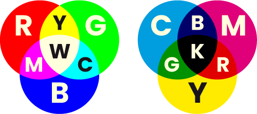
RGB and CMYK colour models
One thing to bear in mind is that each colour model has a different range (or ‘gamut’) of colours available within it. RGB has a greater range than CMYK, which means that CMYK is the most limited in terms of what it can achieve colour-wise. This is why, in litho and screen printing, separate ‘spot’ colours are often used where the desired colour is not achievable, for example if it is a particularly vibrant shade or a special metallic effect. These colours can be used either in place of, or in addition to, the full colour process.
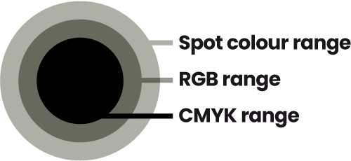
Colour ranges/gamuts
The most common colour system currently in use for this purpose is the Pantone Matching System®, a range of named, formulated colours, adopted as a recognised standard in the printing industry the world over.
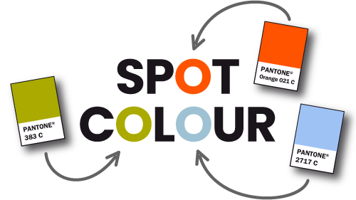
Spot colour
In digital graphics (i.e. those created electronically), there are 2 basic types of image structure—vector and raster (also known as bitmap).
Vector graphics contain the information to build them using nodes (points), lines (connecting the nodes) and fills (filling within the shapes).
They are crisp, infinitely-resizable graphics, and ideal for logos, diagrams, charts, etc. They are generally created using vector or ‘drawing’ software packages like Adobe Illustrator or CorelDraw.

Vector image
Raster images give tonal range and pictorial detail, and are ideal for photographic reproduction. They are built up using an array of picture cells (pixels).
Unlike vector graphics, the smoothness of a raster image degrades as it is enlarged—the pixels get bigger, resulting in what’s known as ‘pixelation’.
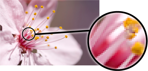
Raster image
The quality and resolution of an image need to be adequate for the medium being used, and the size the image is being used at. You can take quality out of an image, but you can’t easily put it back in, if at all.
This comes to light particularly in JPEG images, where the act of saving the file also compresses the data, losing a proportion of the detail in the image, forever. How much loss there is depends on the save settings used.
In the worst examples of this, you can see what are called ‘artefacts’—jagged or smudgy areas which spoil the appearance of the image. If you are editing and saving an image, it is better to save in the native format of your editing software (for example, Photoshop’s .psd) as you work on it, and only save a copy to JPEG when your final edited image is ready to go, as with a JPEG, the more you open and save the file, the more quality/detail will be lost.
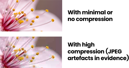
JPEG artefacts
As a guide on resolution, where ‘ppi’ is pixels per inch:
images for the Web should be 72 ppi at 100% size |
images for e-books should be 72 ppi at around 200% |
images for desktop printing and slides (Word, PowerPoint, etc) around 150 ppi at 100% |
images for digital or litho printing (e.g. for printed books) around 300 ppi at 100% |
images for large-format graphics, such as exhibition panels, should be around 72 ppi at 100% size (or 300 ppi at 25%), unless there is no photographic content (e.g. type only), in which case vector artwork is best if available. |
Finally, beware of lifting images, randomly, from websites. Firstly, there is the issue of quality—many images used on the Web have been overly compressed, to keep page load times down. Secondly, there is copyright infringement—if you use someone else’s images without their permission, you can be prosecuted. It’s best to use good quality images that you already own (and have the right to use), images created and made available specifically for general use, such as those from stock image providers, or to commission your own photography.
The most common and generally useful image formats are EPS, JPEG, TIFF, GIF, PNG, SVG and PSD. Each format is described below, along with its good points and bad points.
EPS can be vector or raster.
For: If vector, can be used at any size without editing, and with no loss of quality. |
Against: Can only be viewed/edited in a dedicated vector graphics (drawing) package such as Adobe Illustrator, CorelDraw, etc. |
JPEG is a raster format.
For: Allows compression for smaller file sizes—good for file transfer/storage, e-mail, the Web. |
Against: ‘Lossy’—loss of information, and therefore quality (introduction of ‘artefacts’), as you open-edit-save-close. |
TIFF, like JPEG, is a raster format.
For: No compression, so, potentially, better quality than JPEG. |
Against: Larger file sizes. |
GIF is also raster, and is best for images with more limited textural variation; used widely on websites.
For: Can have low file sizes, depending on how complicated the image is, and will permit transparency—it’s possible to have areas of the image where what’s behind it shows through. |
Against: Limited colour range—not the best format for subtlety. |
PNG combines the subtlety of JPEG and TIFF with the transparency ability of GIF.
For: Particularly useful in PowerPoint for ‘cut-out’ graphics, and on the Web for clean edges on transparent backgrounds (when in 24-bit format). |
Against: Isn’t as widely supported as other formats. |
SVG is a vector format, originally created for use on the Web.
For: Can be used at any size without editing, and with no loss of quality. |
Against: Not as widely supported as EPS. |
PSD is a raster format that can contain vector elements, and is the native file format of Adobe Photoshop.
For: Best raster file format for placement into Adobe InDesign documents for things like page layout. |
Against: Not as widely supported as other formats; sometimes needs to be flattened (all layers within it merged into a single, flat layer) to be useable. |
Colour is important to us—the colours we choose to wear, the colours we paint our walls, etc. These choices usually revolve around how we want to feel and what we want others to feel.
It’s worth considering this when we choose colours for our designs, as well as the practical implications of those colours, and the way we want to use them.
The two main factors involved in our emotional responses to colour are:
our own innate preferences (love/hate, gut reaction) |
external cultural factors (red for danger, black for mourning, green for environmental issues, etc). |
Colours can have different meanings attached to them, depending on the context and prevailing culture. For instance, dressing in black can indicate mourning, but it can also be a signifier of the personality of the wearer, e.g. melancholic, serious, sensitive, dark, apart from the mainstream. First Direct Bank uses black to communicate qualities such as business-like, straightforward, sophisticated, different.
Here is a range of colours and some possible connotations:
Greys: Neutral, although sometimes dull and boring. Warm greys: intimate, cosy. Cool greys: cold, hard, steely, sophisticated. |
Reds: Powerful, strong, bold, warm, dangerous, sexy. |
Oranges: Bright, fresh, bold, warm, lively, modern. |
Yellows: Acidic yellows: lively, fresh. Redder yellows: warm, mellow. |
Greens/Blues: Natural, fresh, peaceful, solid, established. |
Purples: Bold, strong, opulent, relaxed. |
Pinks: Vibrant, feminine, soft, infantile, subversive, (shocking!). |
Browns: Natural world, comforting (think chocolate!). |
You can, of course, choose any colour you like, but think about the emotional response others may have. Relaxed and harmonious, or shocking and discordant? Exciting and vibrant, or solid and reliable? Premium and exclusive, or cheap and cheerful (or cheap and nasty!)?
The colours you choose can say quite a bit really.
There are thousands upon thousands of fonts out there to choose from—how on earth do you decide which ones are appropriate for your design? The main considerations are:
Are they legible at the size and colour you want to use? |
Are they appropriate? |
Do you have the fonts available to you? |
Each font is designed to be used for certain applications—some only work in large headings, some only for body text, others will work happily in all situations. As a general rule, the simpler and clearer a font design, the more flexible the font will be, but this is only very general—other things, such as the relative size of the upper case (capital) and lower case letters within the font, or what the variation is between the thickest and thinnest parts of the characters, can determine how easy the resulting text is to read at certain sizes and in certain quantities.
Whether a font is appropriate or not is a mostly subjective judgement, but check whether the attributes of the font design you’re using marry up with the subject matter or the feeling, or image, you want to create. If there’s a clash, you’re probably using the wrong font, even if you happen to like it.
Computer operating systems generally come with a number of fonts already installed, so anyone who has access to a computer will have at least a few fonts at their disposal. If you don’t want to be limited to these however, you have a number of options:
Find a website that has fonts you can legally download free of charge. This can be a useful way of obtaining fonts on a budget, but you’ll probably find many of them will be poorly designed, have limited character sets, or even be unusable—you’ll need to select, carefully, the few good ones from the multitude of bad ones. |
Purchase a CD/DVD of fonts, or a software application such as a drawing package which comes bundled with a selection of fonts. |
Browse one or more of the many font vendor websites, and purchase individual fonts from there. This is the most expensive option in terms of cost per font, and you normally have to buy each font separately (i.e. regular, italic, bold, bold italic won’t come together, each one will be a separate purchase). One good thing is that these web sites often allow you to test a piece of text in a given font, to see what it looks like before you buy. |
Another consideration, in addition to these, is that if you’re producing an electronic document which is to be opened, viewed or used on another computer, you’ll need to make sure you use fonts that will almost certainly be found on that computer. If you don’t, the viewer will probably not see the document as you created it, unless you are able to embed the font, as in PDF documents, for example. At the moment, that pretty much limits you to fonts like Arial, Courier, Georgia, Tahoma, Times New Roman, Trebuchet and Verdana. Oh, and er… Comic Sans (see more on Comic Sans below).

Common standard computer typefaces
Accurate punctuation and spelling are vital to the interpretation of text, and getting them wrong can lead to embarrassment or, at worst, misunderstanding, so it’s worth taking care over them. Remember, spell checkers will only confirm that a word with that spelling exists in your application’s database, not that you’re using the correct word! Watch out for common pitfalls like there/their/they’re, your/you’re, etc. If you’re intending to publish a book then ideally you should, at the very least, employ a proof editor to cast a final eye over your manuscript, before committing to publication.
Unless confusion is the effect you want, keep it simple. If you think you’re going to need variation in your text for emphasis, choose a typeface which has a family of variants like regular, italic, bold and bold italic, so you can create interest and emphasis but keep the appearance unified.
It’s the accepted norm in novels, text books, and the like, but in marketing materials, for example, great chunks of text can have a reader losing interest pretty quickly. Breaking text into shorter paragraphs, using headings and subheadings, emphasising key words or phrases in larger, bolder or italic type, using columns—any, or all, of these can help create a document that’s easy to read and keeps the reader interested. Remember to exercise restraint though—don’t be tempted to overdo it! Of course, using graphics or images can help too.
Blackletter designs like these originate from the days of illuminated manuscripts written by hand and were never written in all-caps. That’s why, if they’re used in this way, they are virtually illegible and just plain wrong! Actually, this applies to many typefaces, particularly script faces with complex or decorative designs.

Blackletter or script typefaces in all-capitals
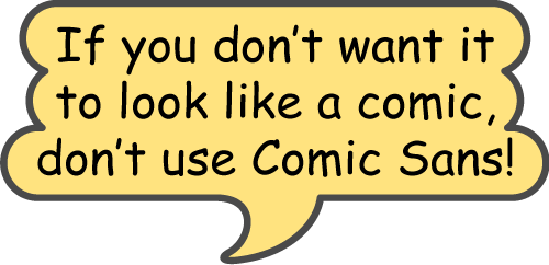
The clue’s in the name—unless you’re producing a comic, give this one a wide berth. It may look ‘friendly’ but it ain’t businesslike or professional, so, if that’s the impression you want to give, DON’T USE IT!
Comic Sans
Overuse of ALL-CAPS is not good. It is a fact that capital (or ‘upper case’) letters take longer to read than lower case, as they are less distinguishable from one another. So, a great chunk of text, all in capitals, will be slightly harder to read than it would be if presented in upper and lower case. Also, all-caps gives text an ‘unfriendly’ appearance, like it’s being SHOUTED AT YOU, and you know how tiresome that can become after a while!
Double spaces aren’t really needed after full stops (full points, periods) when creating text using a word processor. This technique was standard in the days of typewriters, but that is because typewriters exclusively used ‘mono-spaced’ typefaces where all characters occupy the same width, so extra gaps needed putting in to improve legibility. Word processors, on the other hand, in common with all digital typesetting systems, mostly use proportionally-spaced typefaces which have correct visual spacing designed into them, so only single spaces are needed after full stops.

Mono-spaced font
It’s good practise to try and avoid using inch or second marks ("), and foot or minute marks ('), where proper typographical quote marks (“”) and apostrophes (‘’) should be. Fortunately, most word processing and page layout programs have automatic substitution built in, to correct these while typing.

Apostrophes and quotation marks
If you’re at the start of your manuscript creation, it might be worth spending a bit of time setting up some basic paragraph styles for your headings, body text, captions, pull-quotes, etc, that you can apply as you type. It’s good practice, whether you will be doing the final file creation, or employing a designer for that part, and especially if your book will have a considerable amount of heavily-formatted text.
Doing this will not only help you arrange your whole manuscript consistently, but will also save time later on, and reduce the chance of errors and omissions in the formatting of the final text file for production or publication. If you’re going to be creating a printed book, the styles can usually be picked up automatically in page layout applications such as Adobe InDesign, irrespective of what fonts are used in the final artwork. This works similarly with e-book creation.
Better still, if you also have the facility to create character styles for basic formatting features such as bold, italic and bold italic, these too will carry across into your final production/publication file. You can apply them to your selected words and phrases as you go along, in the same way you would use your application’s standard ‘B’ and ‘I’ buttons. Your formatting choices for these words and phrases will then transfer intact, and won’t have to be re-applied, again saving time and reducing formatting errors and omissions.
For export of your final text, Rich Text Format (.rtf) is your friend, allowing the reliable and successful conclusion of the process described above.
If you want to know more about formatting your manuscript in this useful way, check out this short article on the subject. If you still have questions, feel free to get in touch for advice.

 © Studio XB