Here are answers to some questions you might have about technical aspects of creative design, production and printing. If you don’t find the answer you want, please feel free to get in touch for help.
That depends on the type of image being used and where it’s going to end up. There are two basic types of image—vector and raster (also known as bitmap)—and two basic colour modes.
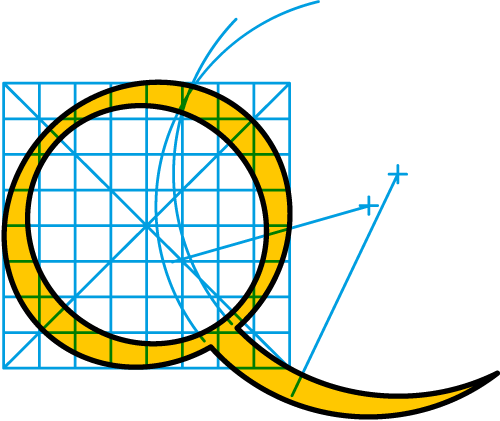
Vector images are made up of lines and fills (which can be solid, tinted or graduated) and are, in theory, infinitely scalable up and down (the concept of ‘resolution’ is immaterial here). Graphics made up of solid colours such as logos, signs and technical illustrations are best created and supplied in vector format. The most widely usable vector file type is EPS (Encapsulated PostScript), and these can be created in drawing packages such as Adobe Illustrator or CorelDraw. SVG (Scalable Vector Graphics) is also quite a common vector format. Vector images are most useful in artwork for printed materials, where they will render crisply and cleanly, and generally have a smaller file size than raster images.
Vector image (with magnified detail)
Raster images are built up using tiny cells of colour, called pixels, and are used for photographic reproduction. Common formats for these images are JPG (or JPEG), TIF (or TIFF), GIF and PNG.
With raster images, resolution and colour mode are of key importance. Resolution, usually measured in pixels per inch (ppi), determines how large and detailed an image will be.
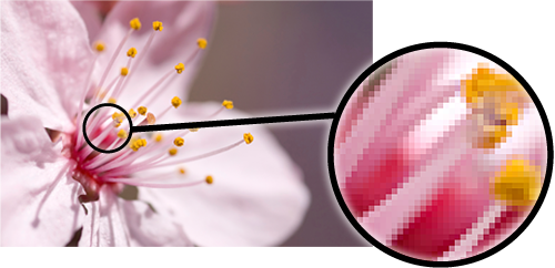
Raster image (with magnified detail)
As a basic guide on image resolution, where ‘ppi’ is pixels per inch:
images for the Web should be 72 ppi at 100% size |
images for e-books should be 72 ppi at around 200% |
images for desktop printing and slides (Word, PowerPoint, etc) around 150 ppi at 100% |
images for digital or litho printing (e.g. for printed books) around 300 ppi at 100% |
images for large-format graphics, such as exhibition panels, should be around 72 ppi at 100% size (or 300 ppi at 25%), unless there is no photographic content (e.g. type only), in which case vector artwork is best if available. |
You’ll find more on raster image formats under Image types and uses on the Hints & tips page.
Colour modes are generally RGB colour (red, green, blue) for everything except commercial print work, where Greyscale (black, white and shades of grey) or CMYK Colour (cyan, magenta, yellow, black) are the norm.
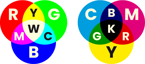
RGB and CMYK colour models
This means that artwork and images for e-books, for example, should be in RGB colour, whereas for printed books they should be Greyscale or CMYK.
In the case of litho print and screen process, what’s known as ‘Spot Colour’ may also be used—see under Colour reproduction in graphics on the Hints & tips page for more on this and the other colour formats mentioned.
Text is best supplied digitally, in a word-processed document created in a software application such as Microsoft Word or Scrivener, and saved, or exported, as Rich Text Format (.rtf).
If you’re creating a book and at the start of your manuscript creation, it might be worth spending a bit of time setting up some basic paragraph styles for your headings, body text, captions, pull-quotes, etc, that you can apply as you type. If you can also create character styles, to apply to individual words and phrases for things like bold and italic sections, so much the better. It’s good practice, especially if your book will have a considerable amount of heavily-formatted text. There’s more about text formatting for books here.
It is also possible to extract text from an already printed document—this can be scanned and processed using OCR (optical character recognition) software but beware: copies of copies will produce mostly gobbledegook—the sharper and cleaner the original, the fewer erroneous characters will creep in. Also, simpler paragraph layouts will enable better results—complicated tables are difficult for OCR to decipher. However, no matter how good the original is, there will always need to be time spent cleaning up, correcting, and checking, the resulting text.
If in doubt, or you need more information, just get in touch.
For confirmation, it’s best to get in touch, but as a guide, the following should be useable, depending on things like how they were originated, file content and quality, and software version.
File formats such as:
.eps (Encapsulated PostScript) |
.jpg (or .jpeg) |
.tif (or .tiff) |
.png |
.png |
.svg |
.psd (Adobe Photoshop) |
Artwork within documents saved in graphics applications such as:
Adobe InDesign (.indd) |
Adobe Illustrator (.ai) |
Adobe Photoshop (.psd) |
Adobe Acrobat (.pdf) |
CorelDraw (.cdr) |
Microsoft Publisher (.pub) |
Quark Xpress (.qxd) |
Graphics can often also be extracted from non-graphics applications such as Microsoft Word and PowerPoint.
There are no guarantees, and in the event that a file is not suitable, the alternative is usually to re-create the artwork, which Studio XB can help you with, and which might actually be cheaper and quicker to do than you think. Again, get in touch for more information and advice.
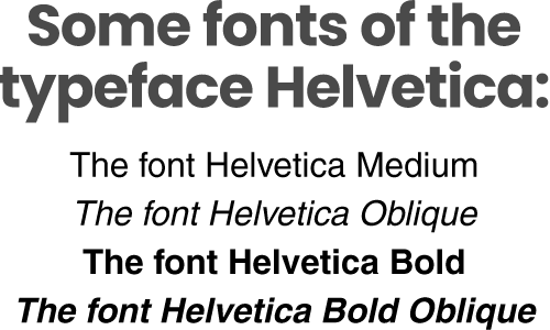
A font is a specific variant of a typeface. For example, within the typeface Helvetica, there are the fonts Helvetica Medium, Helvetica Oblique (Italic), Helvetica Bold, Helvetica Bold Oblique, etc.
Font or typeface?
In the days of metal type (letterpress printing) a font (or originally ‘fount’) was actually the variant of a typeface in a particular size—hence 12 point Helvetica Bold Oblique would have been an individual font. Thankfully, since the advent of computers and digitally-created type, this is no longer the case (no pun intended)!

 © Studio XB