A brand isn’t just a logo, of course—it’s much more than that. Brands have both visual and non-visual aspects to them, but the logo is often a key component in the visual expression of a brand.
Whilst a logo on its own will struggle to represent everything a business or product is about, it’s helpful if it can conjure a flavour of that. In its wider sense, visual branding needs clarity, consistency, robustness and quality of presentation to stand out effectively in the marketplace. For the smaller business, just aping what the corporates do isn’t necessarily useful—aiming for the quality of finish of corporate branding, however, is.
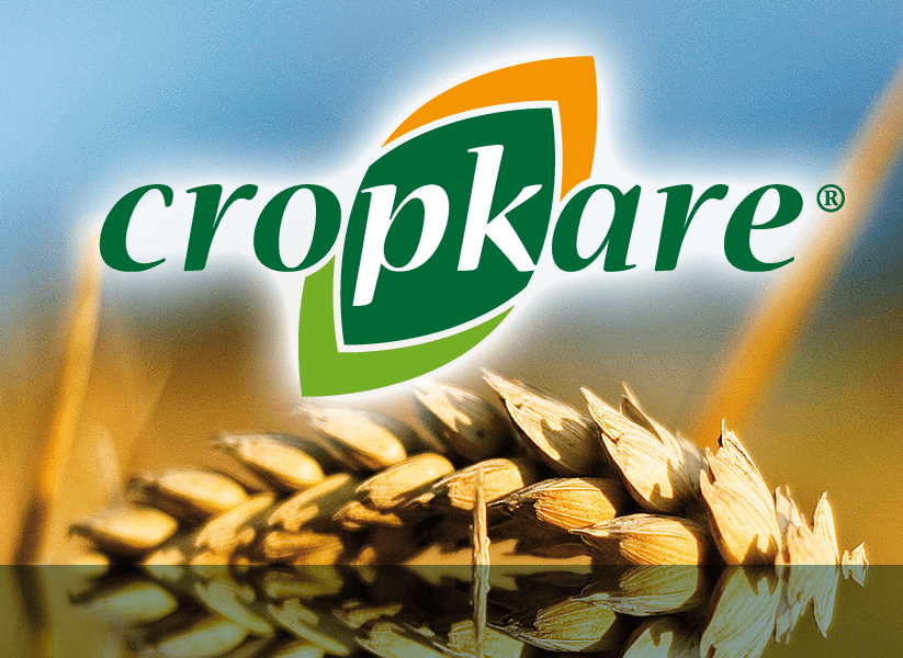
This was a product new to the agricultural scene, using sustainably-sourced materials, which needed to make a splash in the marketplace with a positive, confident, natural feel. The phosphorous-potassium (PK) combination of the product was worked into the name and so is brought out in the logo. A solid start for this brand which has gone from strength to strength since its launch. See also an example of some Cropkare printed product marketing literature and a promotional pop-up stand and lectern.
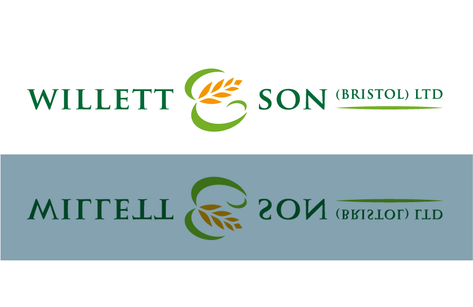
Established in 1870, this company, which specialises in agricultural and horticultural products, has a lot of history behind it, but didn’t, until Studio XB came along, have a coherent, modern identity. In seeking out a new logo they wanted to reflect their history without looking outmoded or irrelevant. The new logo manages to combine tradition with modernity in a simple, elegant solution where, neatly, the ‘and’ becomes a symbol representing their industry.
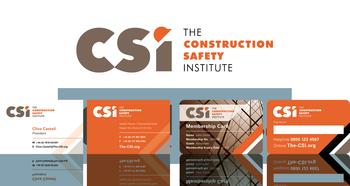
One of my clients, a health and safety consultancy, was instrumental in assembling a sizeable group of businesses in various areas of the construction sector with the aim of creating an industry body for the promotion of safety in the workplace. A new logo and visual identity were required that would exude strength and authority but also be unstuffy and approachable. See also the membership pack that was created following this.
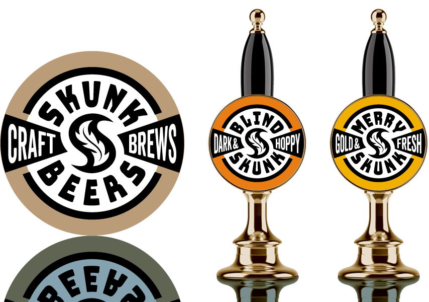
A brewery start-up was looking for an identity they could apply to their new beer, called Blind Skunk. I submitted a broader proposal, suggesting something that could be applied more widely and therefore give continuity and longevity to their branding over-all. See also the bottle labelling design that was part of this proposal.

This was a quick proposal for someone who was in the process of launching a retail outlet specialising in chocolate products. Their brief suggested the possibility of featuring a syringe in the design but I felt that had too negative a connotation. Instead, I opted for something that simply celebrated the ‘joy’ of chocolate in relaxed and playful forms and colours.
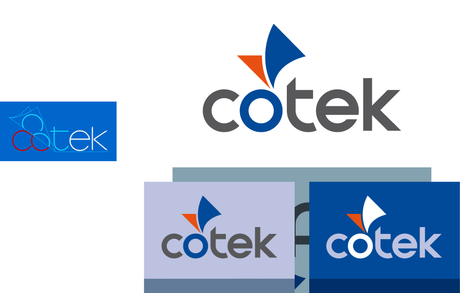
This manufacturer of specialist coated papers had a weak logo and an incoherent identity across their marketing materials. This proposal aimed to correct that by evolving from the original a clean, clear and bold logo that would stand them in good stead for years to come. There were also the beginnings of an overall identity scheme, as shown by the adaptation to different backgrounds and colourways.
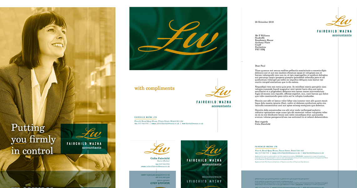
This accountancy practice wanted a new identity that would be stand-out but not wacky. This solution has a hint of playfulness, but is also solid, professional, trustworthy, responsible and coherent across the board, fully meeting the brief.
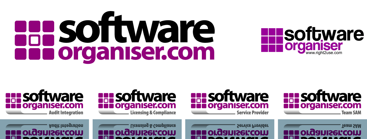
Right2Use Ltd wanted to evolve and refine the identity of their Software Organiser product, without departing too much from the original. See also a virtual pack design for the product.
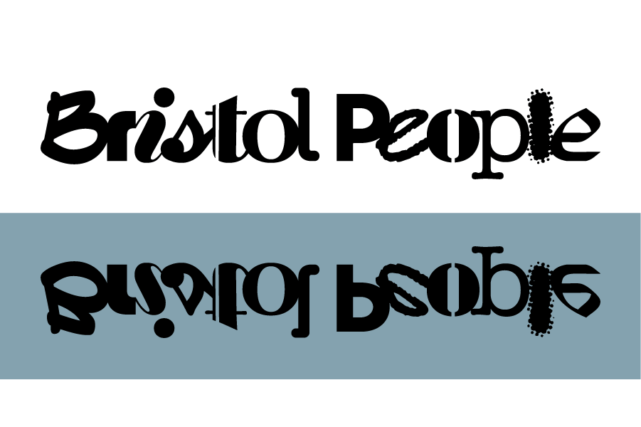
Before embarking on a new photography project—documenting the lives of people in Bristol, England—Ken wanted a logo to use in its promotion, both during the project and after its completion. The idea here was to use a variety of letterforms as a visual metaphor for the varied personalities a city contains—people from different backgrounds, ethnicities and walks of life. While very different from one another individually, together the letters form a harmonious and balanced whole.
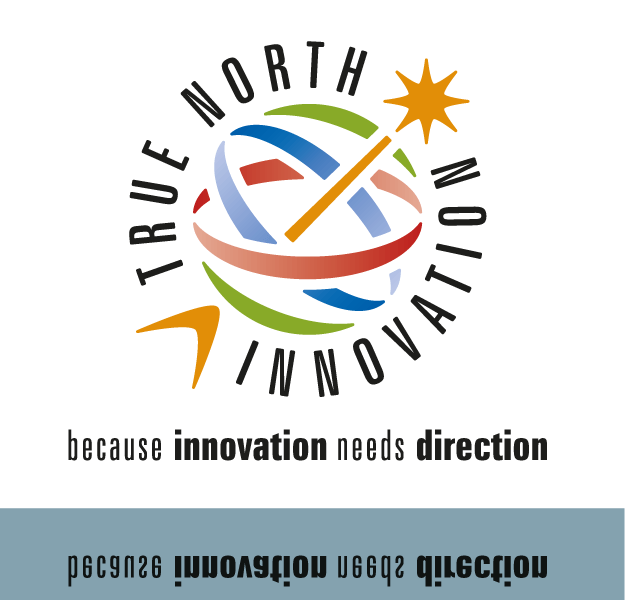
Rowan ran a consultancy that focussed on innovation in business. Initially inspired by the colourful identity of a major online player that she admired, she wanted to capture some of that in her new logo. The result was a mark with an inventive feel, based on the form of an armillary sundial—a device which has to point true north in order to function correctly. A number of ideas came together here positively to form a coherent, inspiring whole, underscored by a meaningful strapline created to go with it.
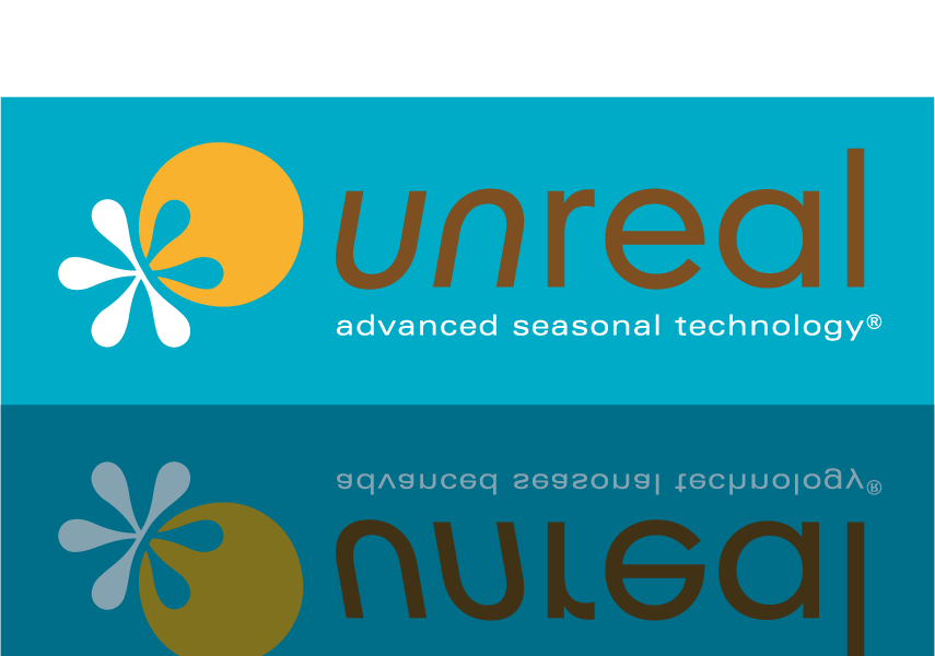
Liz was launching a new sunless tanning product into a competitive market. Her high-quality product uses technology she’s developed to give a natural-looking tan which is attuned to the seasons and she needed an attractive visual identity for it that was right for the market. The logo uses a dual sun-and-frost motif to represent the seasonal aspect, with a vibrant colour scheme that positions it perfectly as a tanning product. See also the triple roller banner display created for promotional use.
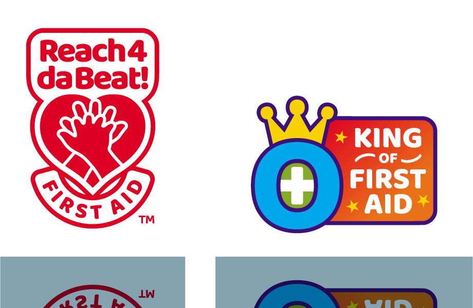
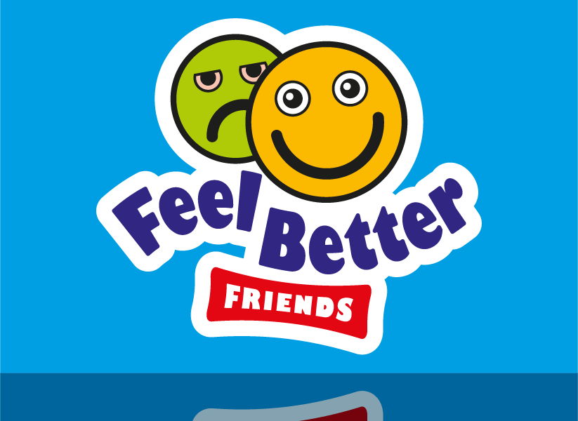
Kingsley O, popular First Aid trainer and self-styled King of First Aid, wanted accessible but solid branding to apply to his educational products such as board games and books. See also the design for the Reach 4 da Beat™ board game and its accompanying book.
Using her knowledge of car sickness in children, ‘mumpreneur’ Jacqui fashioned a new product from scratch—a portable sick container with a friendly appearance and many useful features. With a final prototype ready her drive was now to get it into production and bring it to market. Her initial logo was not strong but had a solid basic idea, so the task here was to take that idea and beef it up into something worthy of a neat product. See also the associated brochure, roller banners and product character face artwork created for development and promotion.
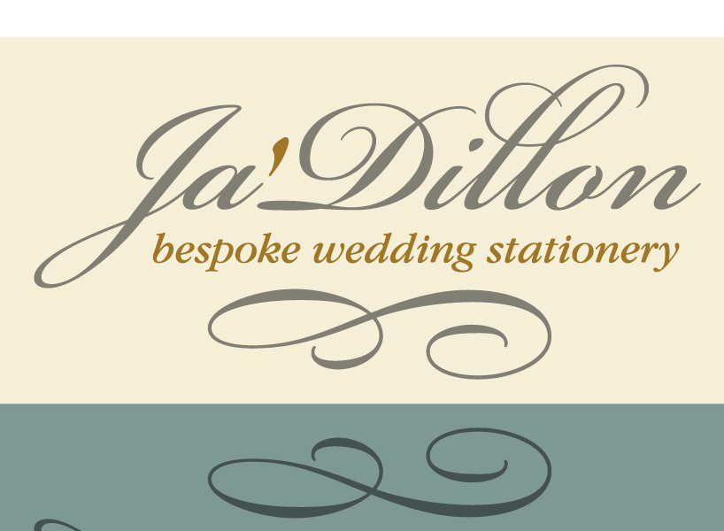
Julie-Anne’s newly-established wedding stationery business had got off to a promising start, with an attractive product range and bespoke service on offer. What was missing though was a logo for her to use on her website and marketing materials. Cue a classy, bespoke logo from Studio XB, to do justice to her product. Ta-dah!
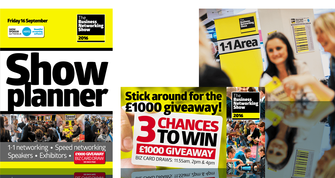
When 4Networking was planning to branch out into the world of business shows, the brief for the branding of these shows was clear—there was to be virtually no visual connection at all between them and 4Networking. The desire was to open the event out to members of all business networks and minimise any perceived 4Networking bias. What it would have in common though was liveliness. So evolved a strong, consistent and energetic identity which was applied to all venue and promotional materials. See also some speaker staging backdrops and social media graphics for the events.
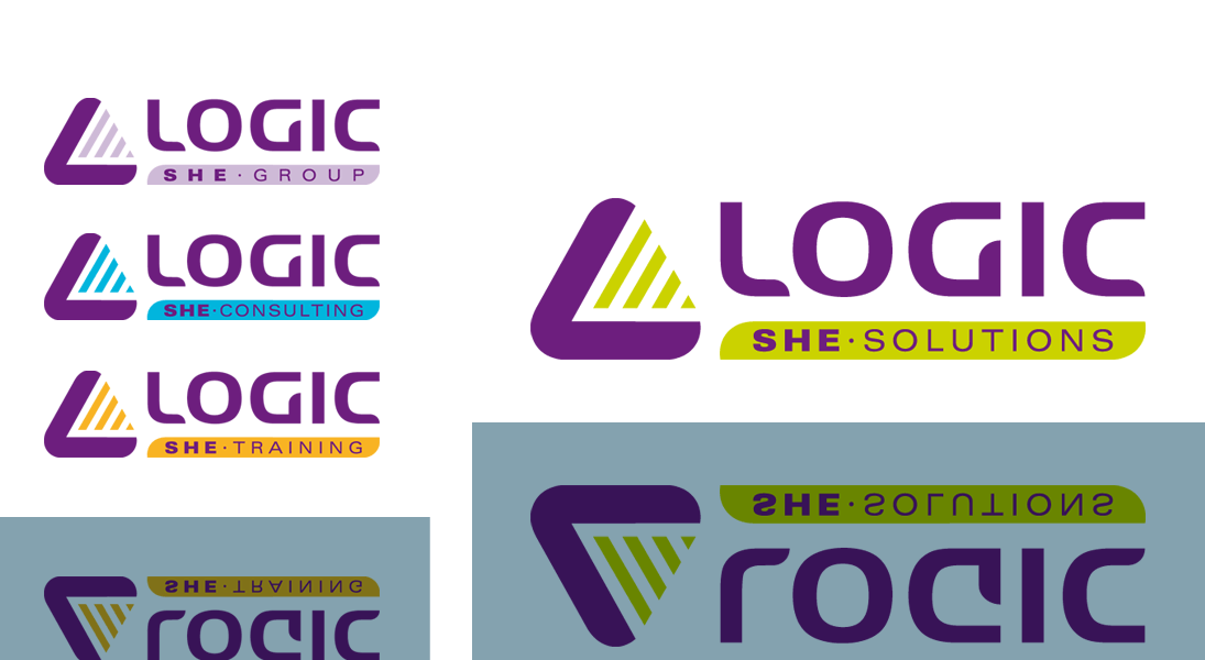
On splitting the company out into divisions, this safety, health and environmental (SHE) consultancy wanted to create a harmonious and unifying identity with a new logo to replace the home-grown and rather uninspiring one that had evolved over a number of years. The crisp, solid forms, evocative of safety symbolism, are rendered in a weighty but unstuffy purple for the group, combined with a punchy highlight colour for each division to inject some immediacy.

 © Studio XB