Getting print right requires technical knowledge and attention to detail.
Printers will often be found shaking their heads in dismay after being presented with artwork that’s inadequate for the job! Then, of course, there’s the all-important design part—getting the brand and message to sing. Packaging is a subset of that, with its own requirements and challenges.
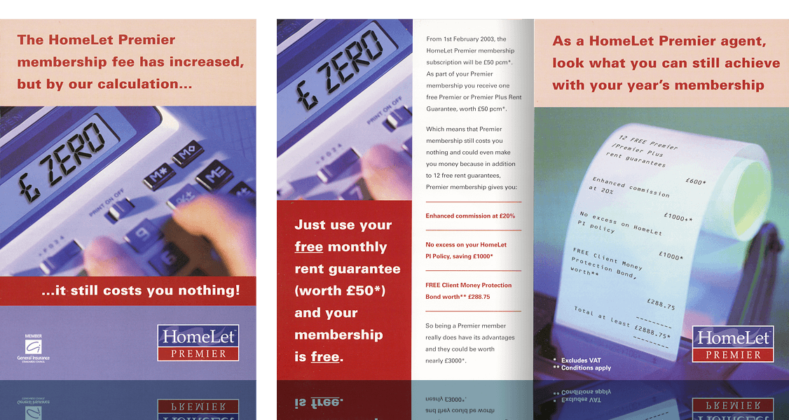
This one goes back a way, but it still stands up as a nice example of how to get one simple point across stylishly and convincingly. Putting a positive spin on what could be seen as bad news, the product brand is reinforced through consistent colour and style across the images, text and layout in a clean, understated way.
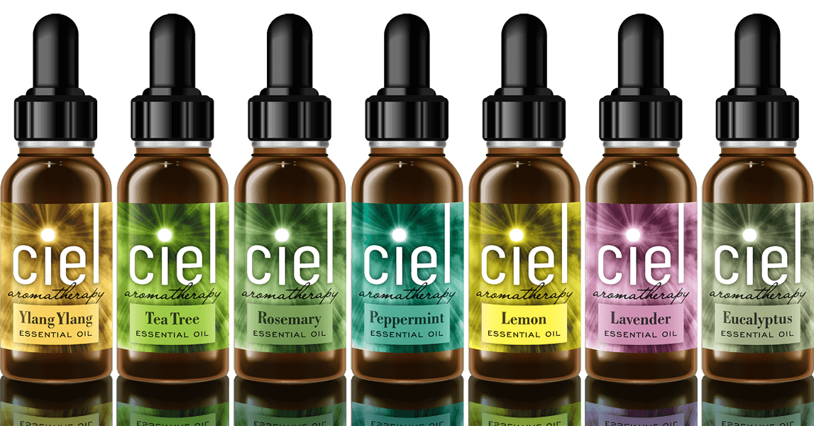
Caroline wanted to sell her own range of bottled essential oils as part of her aromatherapy business and needed branding and labelling created for it. Her original intention was to simply use her business name as it was, her initials CL. I was concerned, though, that this would be a bit prosaic for a product of this nature. It occurred to me that the word ‘ciel’ (‘sky’ in French), which has the same pronunciation, might be a more imaginative solution and offer a good theme to base the branding on.
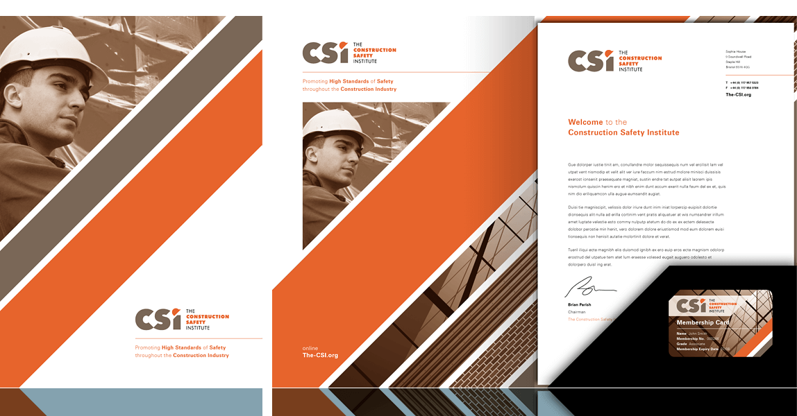
One of my clients, a health and safety consultancy, was instrumental in assembling a sizeable group of businesses in various areas of the construction sector with the aim of creating an industry body for the promotion of safety in the workplace. With a new logo and visual identity created, the next task was the creation of a membership pack including the folder, letterhead and membership card shown. See also the logo and visual identity.
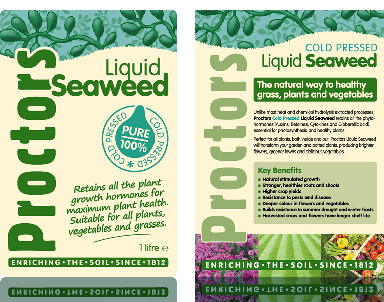
The introduction of a new product to the vast Proctors range required a visual treatment all of its own. Liquid containers can be dull, uninspiring things, and the labelling shown here (left) endeavours to counter this with a lively, informative design that promotes the contents effectively. Promotional materials then followed this style and expanded on it, as shown by this leaflet example (right).
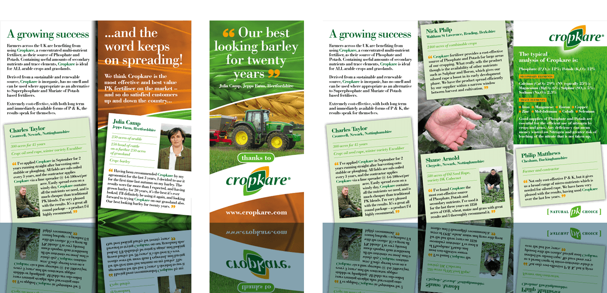
With glowing feedback from farmers about Cropkare after its first year on the market, a new leaflet was designed to capitalise on this and win over even more new customers. The correct flow of information was vital here, to lead the reader from the strong opening statement, through the compelling testimonials, to product data and where to purchase. See also the Cropkare logo creation and a promotional pop-up stand and lectern.
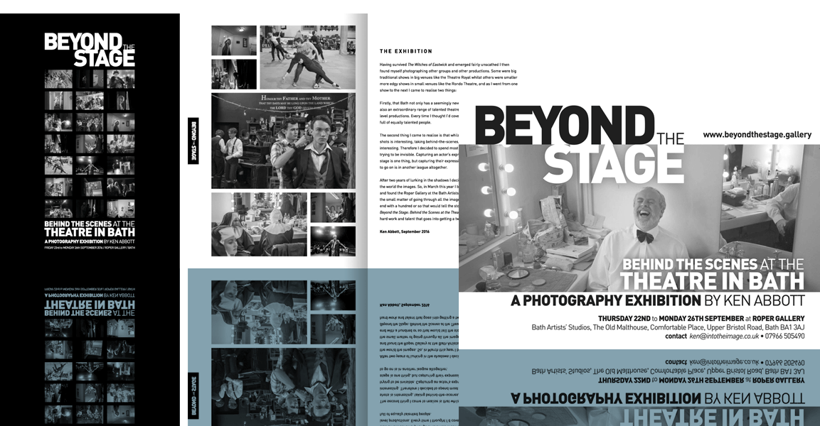
Ken wanted a no-nonsense style for the promotional materials for his photography exhibition, for use before and during the show. With all his images being in black and white, it made sense to follow that through in the presentation so as to place the photographs centre stage.
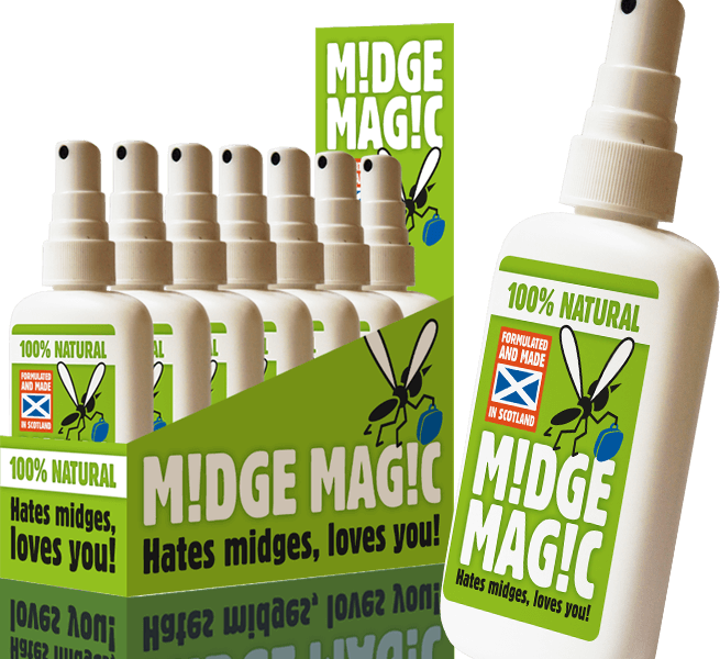
Yumm produced a range of hand-made natural skin products, and for this new product, a midge repellent, they wanted a brand that stood completely apart from the rest of their range; they also wanted help with the name and strapline. Help was given to hone these, and multiple messages were put across with a strong visual identity and a touch of humour, on bottle labels and a proposed point-of-sale box.
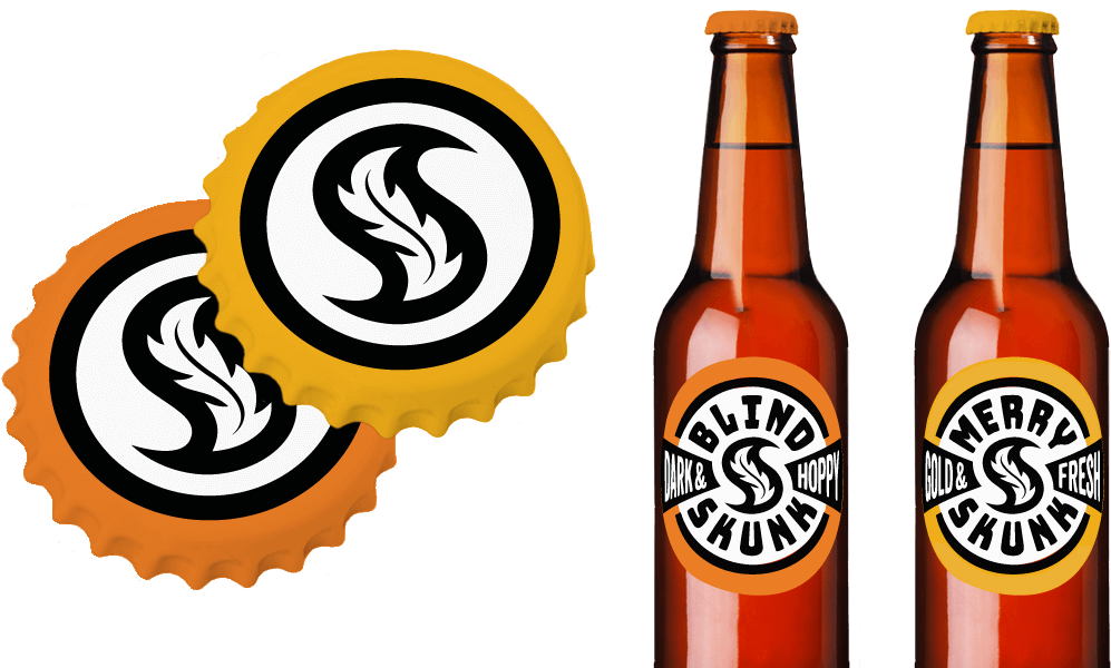
A brewery start-up was looking for an identity they could apply to their new beer, called Blind Skunk. I submitted a broader proposal, suggesting something that could be applied more widely and therefore give continuity and longevity to their branding over-all. For product packaging I proposed a simple circular bottle label design that could be adapted in multiple colourways for a range of products, and a complementary bottle top. See also the branding design that was part of this proposal.
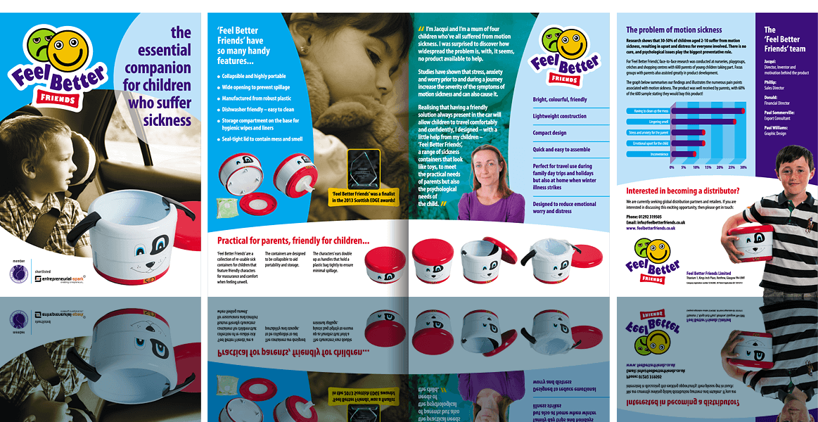
Using her knowledge of car sickness in children, ‘mumpreneur’ Jacqui had fashioned a new product from scratch—a portable sick container with a friendly appearance and many useful features. With a final prototype ready it was time to get it into production and bring it to market. With a punchy logo to kick things off, this brochure was developed to help sell the concept to potential distributors and retailers. See also the associated logo, roller banners and product character face artwork created for development and promotion.
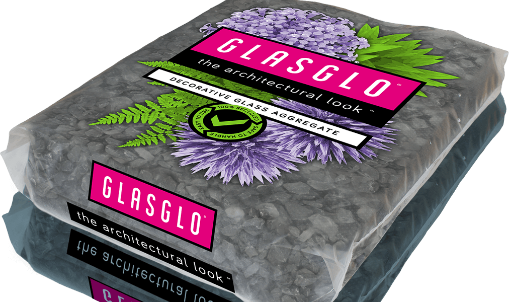
Restructa, a company specialising in electronics recycling, had built up a large stockpile of cathode ray tube glass from television and monitor screens. This they had processed into a great-looking and totally safe aggregate, ideal for domestic and commercial landscaping uses. Shown here is a suggested branding and packaging design for marketing Glasglo in a bagged, palletised form through garden and building supplies outlets. The aim was to promote Glasglo as a sophisticated and novel alternative to traditional aggregates and gravels.
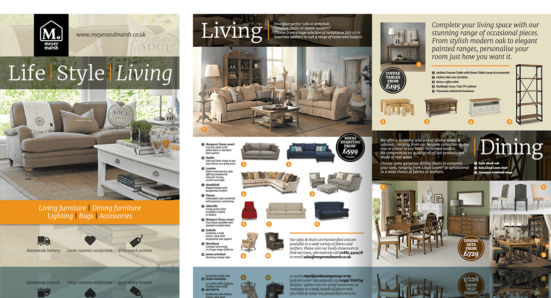
This independent home furnishings retailer, with a retail unit and an online shop, wanted a 4-page A4 hard-copy brochure to dispense to browsing visitors in-store and use for other marketing purposes. It was vital that the brochure tied in visually with their website, so the task here was to bring the content together in a way that did this but also worked as an effective brochure narrative.
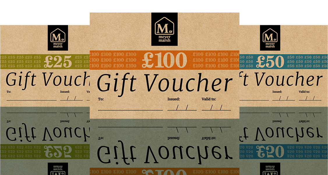
This independent home furnishings store wanted a simple-but-effective design for gift vouchers for a range of prices. They wanted a straightforward, smart-looking design with colourways that would complement their no-nonsense choice of print medium, Kraft board.
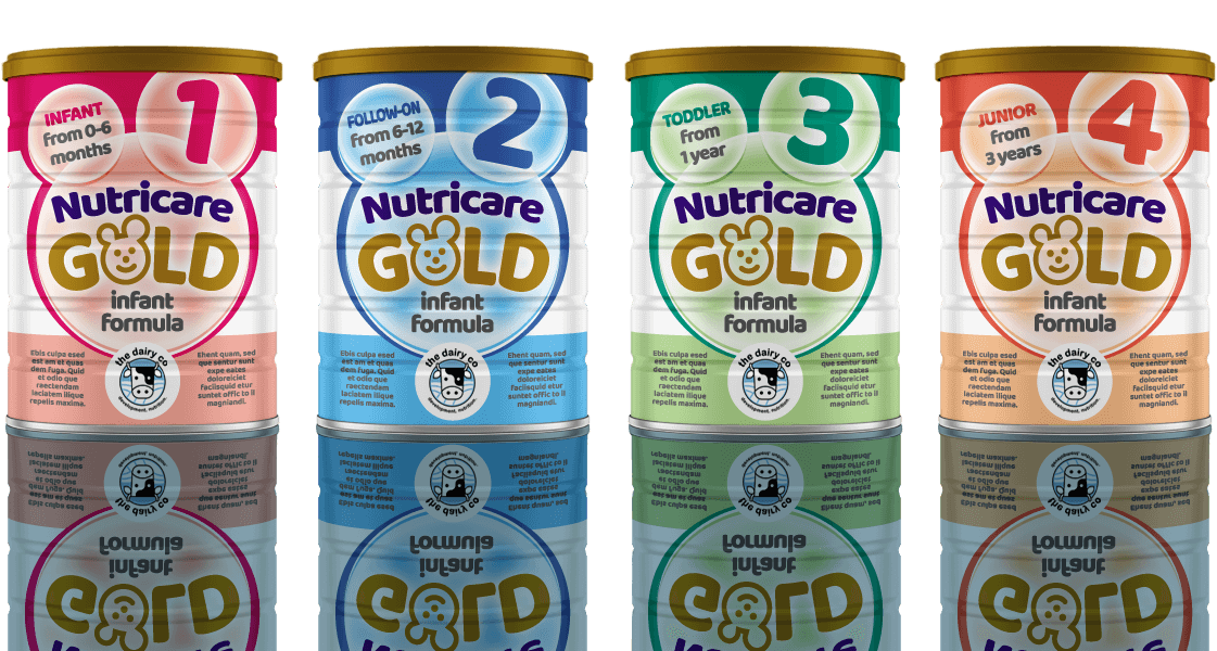
This was a speculative project where the prospective client was looking to refresh their product packaging. With no existing product branding to go on, their range of infant milk formulae needed to be distinct from one another but have a ‘family’ resemblance. The solution was to create a consistent brand name appearance and label layout, and vary the appearance for each product variation using a key colour for the background and other elements.
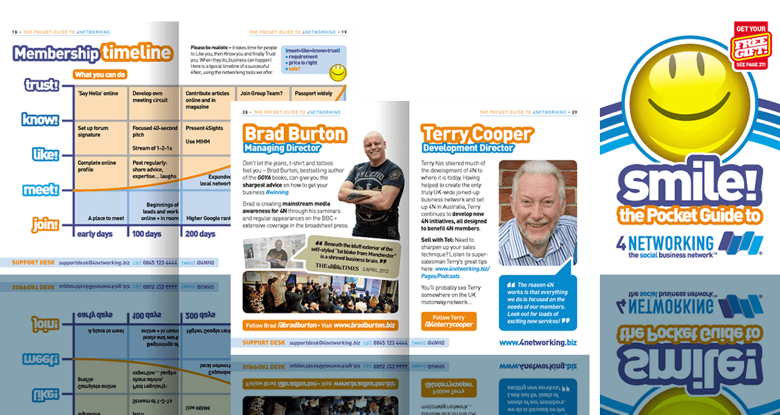
This comprehensive A6-size booklet was created to lead the newcomer through the 4Networking business networking experience. It contained plenty of information and advice on getting the most out of membership, and promoted the relaxed, welcoming vibe.
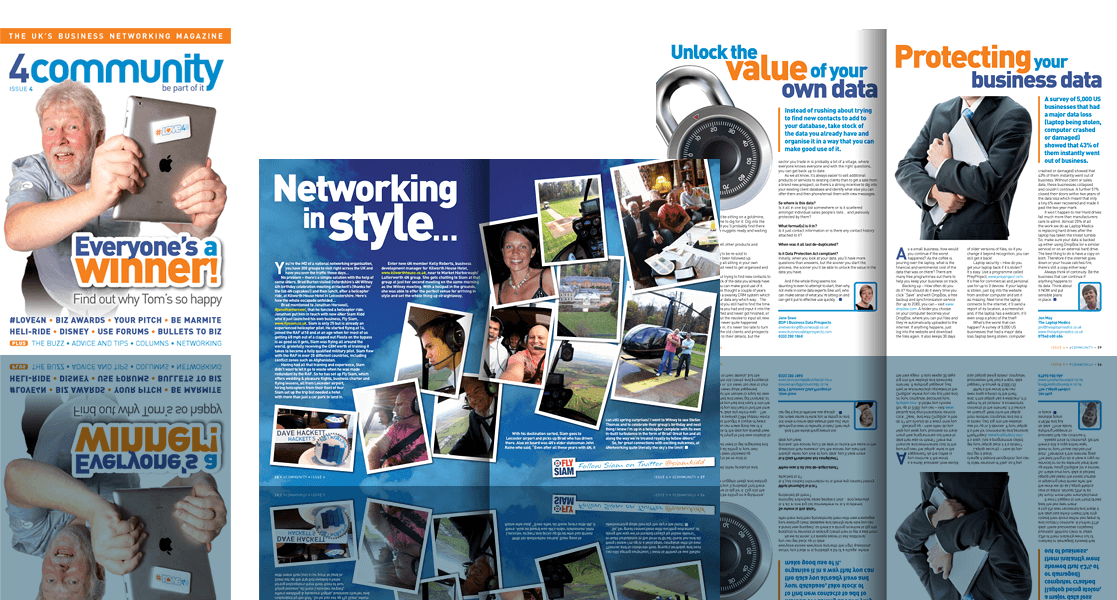
This 68-page A5 full-colour magazine for 4Networking was written for the members, mostly by the members, aiming for an accessible but thoroughly professional finished product with a visually interesting but clean look. The quality of the content and the design would help ensure it was read cover-to-cover and was a great ambassador for 4N.
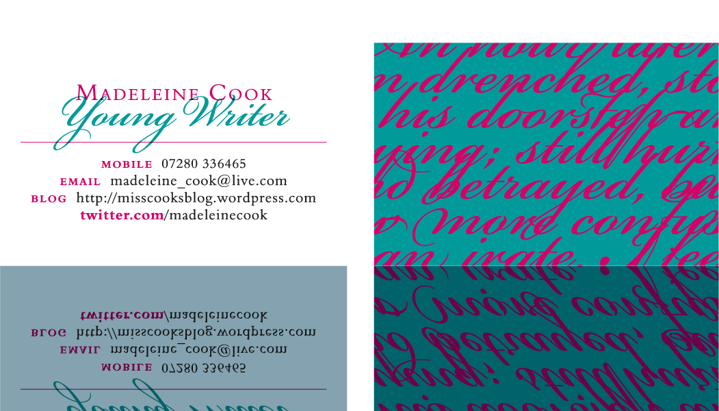
A young writer, as yet unpublished, wants an impressive, well-designed card to give to people she meets as she seeks to establish herself. What better way to set it off than with some of her own writing, displayed with vibrancy and immediacy?

 © Studio XB