The area of digital media covers a wide range of applications, but the common theme is ‘screen-based’.
Unlike, for example, printed graphics, there is not necessarily an exact connection between the original artwork and its final rendering, because this depends on an end user’s viewing screen. Each application has its parameters, and by paying close attention to these details, your message will shine through in its best light.
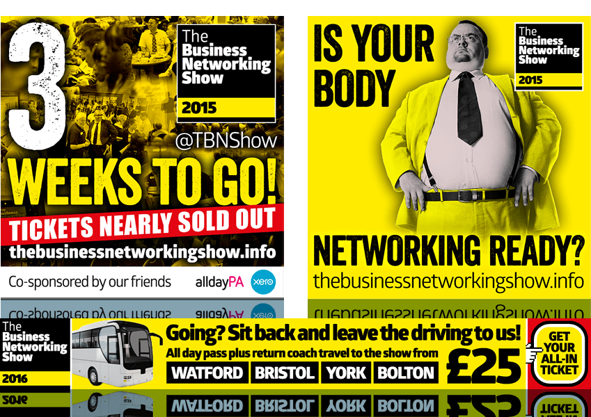
The build-up to this annual event was always about anticipation and preparation—creating a buzz around it. Following the immediate and lively branding style created for TBNS, this sample of some of the social media graphics for it encapsulates some of this excitement. See also some speaker staging backdrops for the shows.
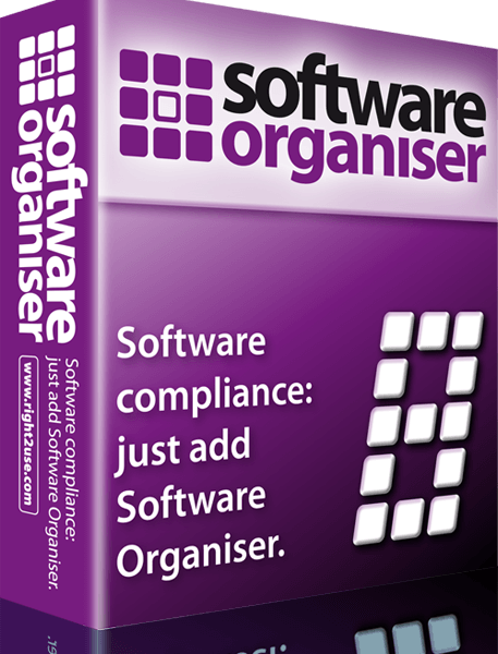
On reaching Version 8, Right2Use Ltd wanted to create a slick new Software Organiser product box graphic to emblazon their website with. The visual language for the new box brought the look more into line with their recently upgraded logo.
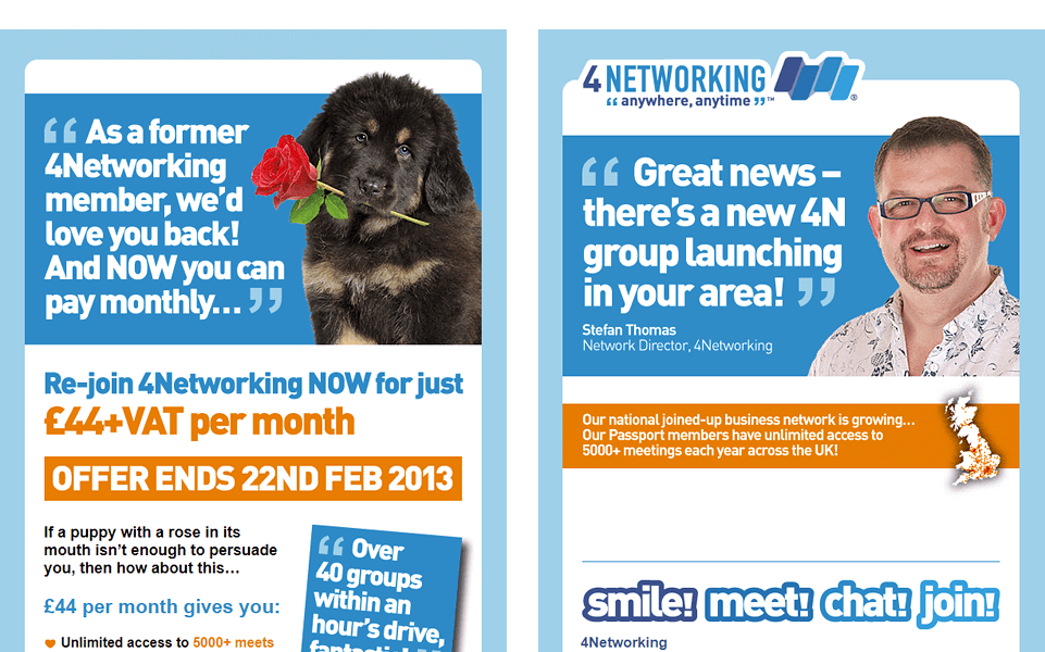
Although they aren’t in the current style of 4Networking materials (that date’s a give-away!), these HTML templates show how a house style can be applied across a wide variety of campaigns so they’re familiar to the recipient and instantly recognisable as being from a trusted source.
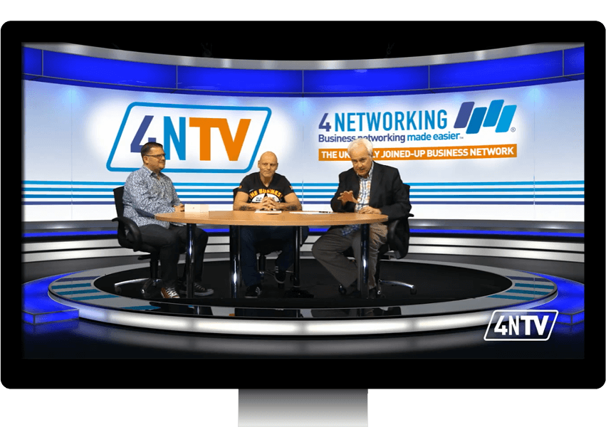
As with many 4Networking initiatives, online channel 4NTV came about quite rapidly—no messing! A semi-virtual set was employed, where the backdrop existed as a digital graphic file (or, more accurately, a set of files to join together, spanning the width), rendered through the use of the ‘green screen’ technique. For this, an instant visual identity was required that was 4N, pure and simple—businesslike but dynamic.
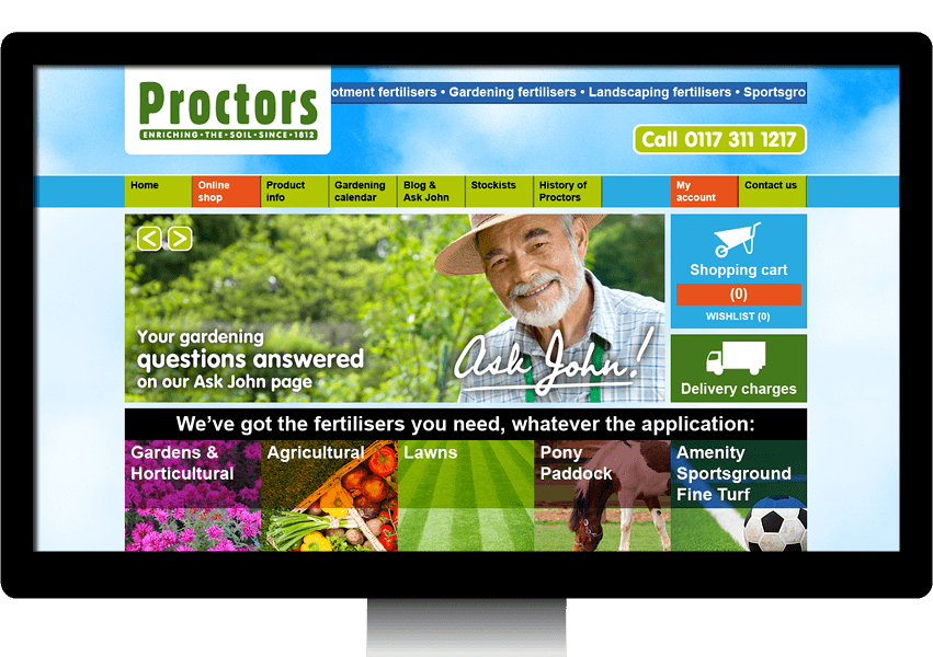
The main aim of this website was to showcase the fullness of the range of products and the depth of experience within the company as a driver for sales. With plenty of bright, fresh colour in the imagery to keep the aims of the customer in mind, colour was also used in combination with layout to direct the eyes toward the important elements of the site. Movement was also added in the form a ticker-tape strip of product categories at the top and a multi-image slider prominent on the home page.
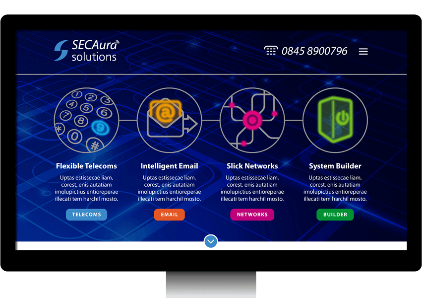
Expertise, efficiency and being current in internet telephony were key to what needed to come across here. With really just an existing logo to hang everything on, a whole visual language was created to set out the stall. Clear paths were given so that potential customers could see quickly what was on offer and find the information they needed within one or two clicks. To add a little extra life to the proceedings, the four main subject graphics on the home page were also animated.
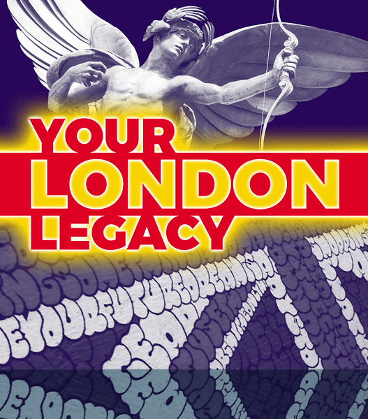
Steve, a London-based insurance expert, was creating a new side-project around his love of all things London, in the form of a regular podcast with guests. He wanted a strong identity that reflected both heritage and current culture. The solution was a strong but supremely adaptable look, enabling a variety of image combinations within a consistent identity.

 © Studio XB